Talking about photographic technique alone sometimes means moving away from concrete application. Inspired by professionals might be a starting point, relying on them is the way to make a difference. We at Studio Concept offer a different approach for graphic marketing in the cosmetics industry that works.
Indice
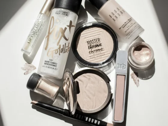
Elevate your bathroom product with unique images with Studio Concept
Particular attention to light, choosing the ideal angle, evaluating field parameters but also saturation and focal length are just a few aspects to be taken care of. Many try their hand at commercial still life but only a few really succeed.
Photography is indeed the art of being able to scrupulously apply the rules of the trade, many people think that to get the perfect shot you need inspiration alone: the reality is made up of preparation, study and a good dose of experience.
Cosmetic photos are an important part of marketing and still life is the starting point of a process that leads to production as a whole. Quality photography is crucial in online sales sections, but it is also important for the development of the advertising concept.
Studio Concept offers a product that starts with creativity but develops on a professional approach because many people try their hand at visual marketing, but few manage to do it properly. Our aim is to offer a tailor-made but, above all, effective solution.
Toiletries for hotels: Albogroup Solid.O Original line
The project for the client Albogroup is an example that goes beyond the canonical boundaries of the cosmetic still life, which stems from the client’s need to go beyond the classic schemes and introduce courtesy lines that enhance the quality of ingredients.
The concepts of nature and low impact on the environment are at the centre. Although solid soaps are a real revolution in hotel habits, the Solid.O Original campaign aims to go far beyond illustrating how to use them.
Nature plays a central role, the blue of the sea but also the green of a meadow are essential in recalling the composition of the products. Even the packaging never neglects a reference to the green through the use of objects: nature, for example, is recalled even by a simple wooden soap dish.
The product still life can communicate a certain dynamic idea, even a hand holding soap in the palm becomes an element that communicates the proportions but also the range available and the details of use.
Contact us for more information on our services
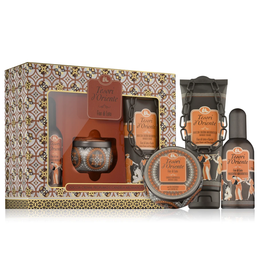
Creating impactful images for Toiletries: photographs for Treasures of the Orient
The variety of products is at the heart of the work dedicated to the Tesori d’Oriente brand, compositions of several subjects are the method chosen in agreement with the client to illustrate the collections by presenting them to the potential customer. Here, communication is played out on detail.
In addition to the choice of a frontal framing perspective, the stylistic cut emphasises the importance of the rule of thirds in the arrangement of subjects. The addition of the elements characterising the fragrances makes use of a composition that is anything but random, but with a studied asymmetry.
The choice of background starts from the need to produce illustrations that meet common commercial standards. White is the neutral colour par excellence, this allows for an organic cut with the content publication portal.
The whiteness of the background is typical of cosmetic photography, and this is underpinned by the measured use of light: shadows are never cast, thanks to the study of lighting. The elements of the collection differ in their predominant colour but are in continuity precisely because of the same play of light.
Enhancing toiletries post-production images: still life for Helen Seward Mediter Bio
The approach to the collections of the Helen Seward Mediter Bio brand is more centred on a posteriori processing, the aim being to convey the sense of a line that reconciles quality with a certain creative dynamism. Since these are products intended for professional hair care, the approach can only look to the art of the creator.
In contrast to traditional standards, the background moves away from classic white. The chosen tones communicate elegance but without neglecting a distinct green imprint. Even the product still life does not neglect the particular choice of settings and dares through the play of depth of field.
Post-production is an element that accompanies presentation, especially when the subject matter represents the packaging. Whether it is the bottles, the displays or the illustrative material, each element relies on a graphic elaboration that is as simple as it is elegant.
The concept that passes is that of a brand that focuses on quality without abandoning a strong creative vein. The brand demonstrates its adherence to the ethos of green production but does not neglect a sense of innovation: the communicative project distinguishes and arrives.
Studio Concept: Innovation and Quality in Visual Marketing
We try to distinguish ourselves in the visual marketing scene by an approach that fuses creativity and professionalism. We are convinced that quality photography is not just a matter of inspiration, but the result of careful preparation, in-depth study and solid experience. Through our experience, we have learnt that every detail counts: from the care of light to the choice of angle, from the evaluation of field parameters to saturation and focal length.
In our work with brands, as shown in the projects for Albogroup and Tesori d’Oriente, we go beyond the mere presentation of products. We tell a story, convey an idea, evoke an emotion. This allows us to create images that not only catch the eye, but also remain imprinted in the consumer’s mind.