Colour communicates, white represents purity in a recurring concept in cosmetic photography. White is also adherence to common standards in e-commerce, hence the importance of colour in a still life that works. We at Studio Concept are at the service of photography that captures, starting with the care of the background.
Indice
Tips for photographing cosmetics on a white background
The choice of white has many functions in the field of commercial still life, but the potential of the option must be based on a solid technique so as to guarantee an effective rendering to the perception of the human eye.
White is the neutral colour par excellence, which is an advantage but could sometimes turn into a disadvantage. The white background risks sterilising the concept behind the photo, making it almost aseptic. That is why it is important to take care of the right setting.
One is quick to say white, the choice of background might not appear as obvious as it seems. It is necessary to play with shades, and to do this one must consider the publication standards but also the product colours. The white features of the subject must be distinguishable.
Working against a white background means physically acting on the play of light, here the use of the exposure meter becomes essential to balance the rendering of the shot. Particular attention must be paid to reflections: glossy products are the essence of beauty still life and mirrored surfaces are a natural source of them.
How to avoid the grey effect on the white background?
The white background is a real test case for still life photography, especially when the focus is on cosmetics lines. White is the standard used par excellence, this communicates the idea of purity and associates it with positive openness towards the customer.
The strength of white lies in its versatility, the distance from the light source can make it appear in shades from grey to black: light is the element that controls its rendering.
Using a white backdrop, therefore, is not enough to obtain such a background. In commercial still life the phenomenon is explained by the inverse square law: if you double the distance between the light and the background, the latter will receive four times less light.
It would all be very simple if one simply applied the simple rule but, in between, there is the product to be photographed. The solution lies in the diversification of light sources. This ensures adequate exposure of the subject but without sacrificing the chosen gradation of white for the background.
Contact us for more information on our services
Photoshop post-production corrections
The photographic technique is important, but so is the virtual retouching phase; once the lighting scheme is fixed, even shots of several products in the collection do not require a special study of the background, but perfection is impossible to achieve.
Even a technically perfect photo may fail the threshold test. Photoshop allows you to create a threshold adjustment layer, this is useful for testing whether areas are out of the desired shade of white.
Correction is not that complicated, you only need to use a brush. The tool allows you to paint the areas to be corrected white, it is always worthwhile to focus on the edges as these dictate the shade of white when loading the image online.
Working on layers allows Photoshop fine-tuning via the adjustment tools, which allows you to intervene only where the image requires it. It goes without saying that the play of shadows in the body of the photo can thus remain unchanged and convey the desired stylistic concept at the time of the shot.
A final test is to display the image on a pure white background, simply set the background colour using the customisation function and select the desired colour. Working on a white background opens up the result to various interpretations, including changing the format.
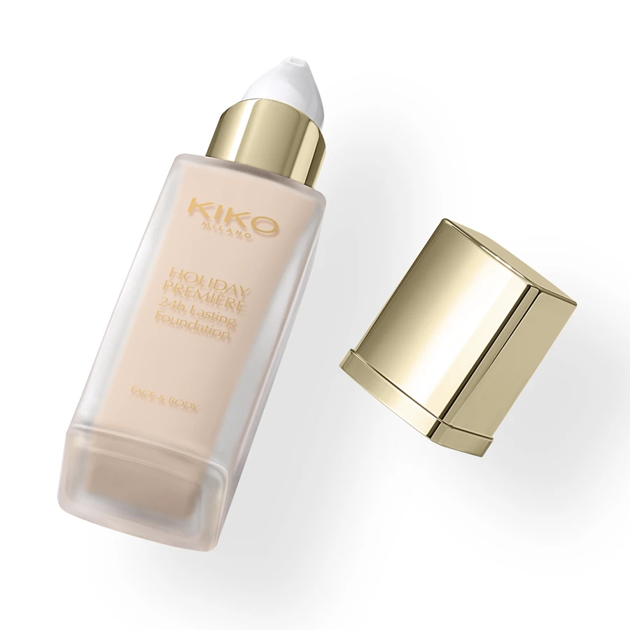
Shots of cosmetic products with white background by Studio Concept
Designing every aspect of Equilibra’s Vitaminica line was an example of how choosing a white background can be the most organic continuous solution. The use of colours in the packaging makes use of white details, the device emphasising the characterising tones of each individual product.
Designing both primary and secondary packaging, adding online and physical visuals at the point of sale means distinguishing the individual item but also linking it to all the others. This is how white plays a role technically but also conceptually.
Acting on the edges means bringing the background of each product to a perfectly comparable level, the final effect emphasises the colours that characterise the packaging of the individual article. White communicates but above all unites through a versatile language.
The use of a white background in cosmetic photography is more than just an aesthetic choice; it is an art that requires technical mastery, visual sensitivity and a creative touch. At Studio Concept, we know that white is not just a colour, but a powerful communicative tool that can elevate the product, emphasising its purity and elegance.
Our experience has taught us that every nuance, every reflection and every shadow has a significant impact on the final result. Through our meticulous attention to detail and technical expertise, we are able to make the most of the nuances of white, creating compositions that catch the eye and communicate the brand message clearly and incisively.