Still life and cosmetics are two terms that too often recur together, so it is easy to fall into a creative vacuum. At Studio Concept, we believe in experience that helps you get that extra something to make a difference. Here are a few pointers for more creative thinking.
Indice
Add creativity with cosmetic samples
The real star of a beauty article is the product; putting it at the centre can make all the difference. Here, one of the most popular trends can turn into a creative way to stand out from the crowd.
The idea is to enhance the colour and texture of the product by letting it take on particular shapes, showing it in a way that is unusual but succeeds in describing the real characteristics of the cosmetic. Creativity must coincide with the concrete, the customer appreciates this.
It all starts with choosing the right background, the solid colour being the one that offers the eye an easier reference. The rest has to come from the creative mind, the right idea arrives when it is needed.
Photograph the simple layout of the product
Playing around with the position of products can be as simple as it is effective; you don’t need much more than a background and a stand. Interesting results can also be achieved just by playing with different orientations in space.
The geometric arrangement is a classic that always works when it comes to cosmetic lines: an example could be the positioning of lipsticks of different shades in a pseudo-random manner but dedicating a foreground to the prominent logo of each.
When the right idea does not seem to arrive, perspectives often change by altering the colour of the background. Not all composition techniques suit the same background. The approach is simple in theory, but experience can make a real difference.
Take an advertising-style image
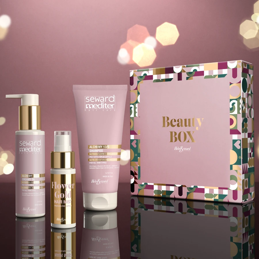
Starting with a branded idea can be a valuable input to create something special, advertising style is not among the easiest things to do but it is an exercise that can lead to promising results.
Here, the material becomes more substantial, proceeding through several style boards and thinking in terms of pre-visualisation sketches. The intention is to cast the style of the brand and, if it is an emerging brand, to search for one that really works.
Advertising style is the testing ground for the professional approach, it is a territory to be explored only through the right partnerships. It is no coincidence that this is the path most frequently followed by the major cosmetics maisons.
Contact us for more information on our services
Monochrome colour composition
This is a field in which the quality of photography has a say. It only takes a little experiment to realise this: the same product can appear quite differently when placed against a contrasting background and then photographed in monochrome.
Here the use of gradients is important, the photographic narrative could use peripheral shading to lead the eye to the product. Monochrome, in a studied approach, can prove to be a simple but effective tool.
The technique opens up the possibility of varying the composition of the backgrounds, some hints could be had from the variation between textured cardboard and opaque acrylic to compare the pleasantness of the result. The monochromatic solution opens up the adjustments of exposure, lighting and shadows: the photographic exercise is guaranteed.
Photographing in flat style: the flat lay
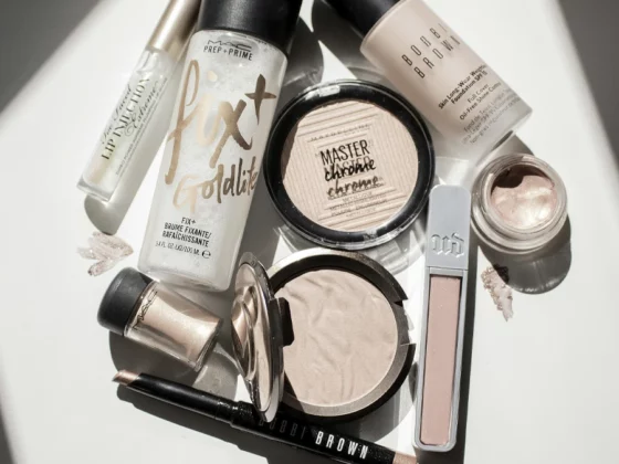
The technique is by no means new; there are many brands that have adopted this creative solution. In itself, it is a particularly simple method to adopt. All it takes is a couple of lights and, inevitably, an absolutely orthogonal perspective.
Here, creativity comes more from playing with the arrangement of the products, it is essentially a stylistic solution that allows an overview of the variations the line is capable of expressing. The trick is to find the arrangement that best enhances the object.
Although the geometric motif might be the first idea, it might be interesting to enrich the scene with water drops or, why not, a sample of the product. Controlling the light is crucial as direct reflection is to be avoided.
Go back to basics and take a photo of the product with a white background
What if the idea that works is the simplest one? One might think of an article with particularly colourful packaging to realise that white can be the natural context.
The game of creativity is played out in the choice of materials for the background, but it is the handling of light that is the real protagonist. The standard technique could be considered overused, less common is the use of light to play with shadows and the shapes they can create.
The typology leaves little room for experimentation: when the technique adheres to standards, the more experienced photographic eye is able to get something out of it.
The combination of still life and cosmetics proves to be fertile ground for those who know how to capture the essence of creativity. At Studio Concept, we have explored different techniques and approaches, proving that the key to successful work lies in the ability to go beyond the conventional.
Our journey through the different ways of presenting cosmetic products has taught us that every detail counts: from the choice of background to the management of light, from the play of shapes to the arrangement of products. Every element contributes to creating an image that not only catches the eye, but also conveys the quality and uniqueness of the product.


