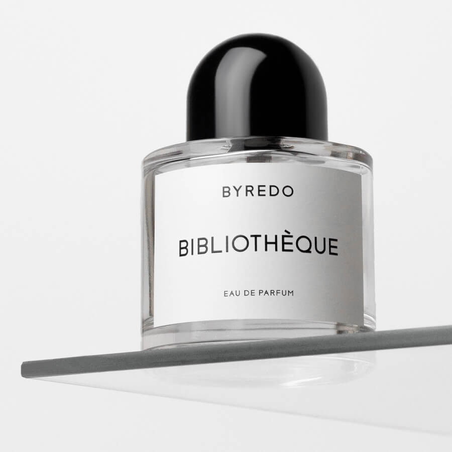
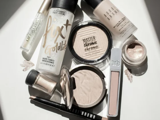
Cosmetics are all about quality and effectiveness but would be nothing without proper presentation, we at Studio Concept put our experience at the service of brands by creating packaging design for cosmetics. Taking care of the design is fundamental but the right attention to sustainability and practicality of use is also needed, these are just some aspects of the packaging that sells. Here are some tips on the subject.
Indice
The communicative function of packaging
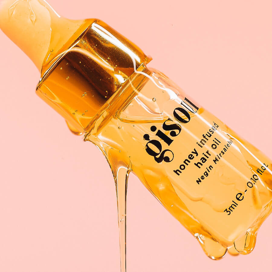
The design of functional packaging starts long before the simple analysis in terms of sales. The starting study draws its basis from the relationships between product presentation and sensory response on the part of the customer, and in this respect the indications suggested by neuromarketing studies are essential. Although the example may appear distant from the field of cosmetics, the sales drops of a well-known brand of potato crisps are a case in point. What was the cause? The miscommunication behind the choice of packaging, of course.
The packaging is itself the product, a hand cream is appreciated for its effects but could never be sold in bulk form. It is the packaging that allows the customer to prefer your brand over the competition. The first selection is the one that takes place directly on the shop shelf, this does not take into account the intrinsic quality of the product but stops at an initial communication level. The first aim is to convince at first glance, studying a functioning packaging is the discriminating factor that can make the real difference.
Materials and practicality in use
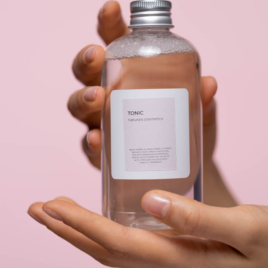
The appearance of packaging is only important if there is a well-defined concept behind it: for example, the orientation of the new generations is increasingly directed towards concepts of environmental sustainability. The selection of materials must therefore take into account the concept that the material itself is able to convey. Sporty lines, for example, recall the dynamism of practical use: in this case, the choice of recyclable plastic can ensure an impact that is both effective in use and environmentally friendly. if on the one hand the particular solution satisfies the customer, on the other hand it helps to reduce costs.
Talking about packaging in cosmetics also means being able to choose materials that are safe for use. Compliance with current regulations must find the right accord with practicality in use. We can take the example of roll-on deodorants, the packaging itself is an integral part of the cosmetic product as it guarantees its easy use and must keep its characteristics intact over time. The design of functional packaging must therefore go through a study aimed at winning over the target but above all at confirming the choice through a positive user experience. Loyalty is an important result.
Vuoi parlarci del tuo progetto? Contact us per un confronto e per richiedere ulteriori informazioni.
The importance of sustainability in cosmetic packaging
Considering the orientation of Generation Z, the outlook is turning more and more in the direction of low-impact productions. The cosmetics industry has a duty to adapt to the latest trends; after all, respect for the environment is more than due.
If the past is marked by the indiscriminate use of plastics, current strategies calibrate materials to the actual life of the raw materials: an example comes from paper that undergoes treatments to contain creams and liquid soaps. Sustainability means studying new materials, effective packaging introduces new ideas. The customer appreciates this.
Personalisation to convey corporate identity while differentiating from competitors
Our experience brings us back to several successful projects, leading brands are called upon to assert their position at the launch of each new line. Cosmetics is a particularly fluid field, the offer must adapt to trends but the packaging must confirm the brand philosophy.
Distinguishing oneself with packaging that works also means being able to assert one’s image over time. Casting one’s memory back to the old Carousel images, examples of packaging capable of preserving its style for at least half a century come to mind. The materials and products evolve, but the packaging confirms the strength of the brand.
Distinctive and innovative design
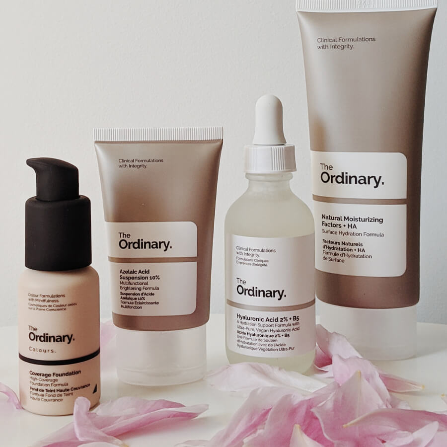
Distinguishing oneself sometimes does not require revolutionary ideas, the difference is in the detail that others have not yet thought of. Although the universe of cosmetics can be considered a jungle of offerings, a professional conceptual study can offer a good basis for standing out through packaging. Where the product has a characteristic colour, the play of transparencies can open up a characterisation that makes the packaging different from others. The idea could have a practical value, constituting a small innovation of useful use to the customer.
Functionality is only one ingredient of packaging that sells, there must also be a careful assessment of the target group the product is aimed at. Young lines must be able to address the public through a fresh and fashionable font, which can distinguish them from more classic lines. A lot of information comes precisely from the purchasing orientation: while on the one hand there are those who are looking for the product they are fond of, on the other hand the desire for novelty must be captured. Here, market analysis can suggest the most effective choice in terms of packaging. Devising the most appealing design may not be enough, it needs to be adapted to trends.
Vuoi parlarci del tuo progetto? Contact us per un confronto e per richiedere ulteriori informazioni.
The influence of colours and design in marketing
Choose according to your personal taste and, rest assured, you will be wrong. This could be called an axiom in sales packaging design, with the gravant that the cosmetics sector is also more sensitive to the natural influence of colours. Considering the psychological aspect is crucial when it comes to associating design with the choice of colours in sales packaging. To realise this, all you have to do is close your eyes for a few moments and think of a sun cream: we bet you thought of a pack with warm, earthy tones? Here is proof of how the brain perceives packaging that works.
If we consider the search for alternative designs and colours, standing out has sometimes led to flops even for the most famous brands of all time. We borrow this example from the soft drink par excellence: during the Christmas holidays, the classic Coca Cola can was produced in a white variant with the effect of a sharp drop in sales. There is, however, the example of pink at Victoria’s Secret, we could consider it the most profound reason for its success. Working on the right balance between colour and design can have interesting effects on the end result, an effective study also aims at this.
Attention to detail to reflect product excellence
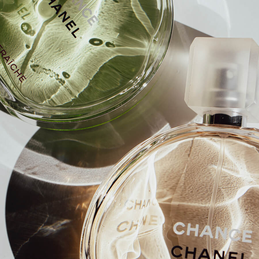
The world of cosmetics runs at impressive speed, the same applies to the graphics applied to its packaging. The quality of the solutions adopted is enhanced by the strength of the messages, the result is a strong product in still life as well as on the shop shelf. Packaging design can therefore not ignore a professional approach.
However, conceptual design must go hand in hand with product features, it is essential that the customer experiences full concordance between what he sees and the user experience. The natural result must be reflected in the choice of appropriate packaging, the same goes for the attention to the smallest detail in the pursuit of luxury. Finally, there is one essential word: foresight. Designing beyond means aiming for a product that works over time.


