Packaging Design for Bottega Verde Wellness Oils
Studio Concept was responsible for studying and creating the packaging design of Bottega Verde’s new line of wellness oils, destined for large-scale distribution.
The stylistic choice fell on a design that reflects the values and philosophy of the brand, trying to keep as best as possible the message it wants to convey to the end customer: the use of natural ingredients and environmental sustainability.
The main objective, in fact, is to communicate to consumers, through the packaging, what the brand promises, its mission and the characteristics of the product. That is why we aimed to develop a design that can be an integral part of the company’s marketing strategies.
The end result, therefore, is a clean and sober design that reflects the brand identity of Bottega Verde, one of the most famous and best-loved brands in our country.
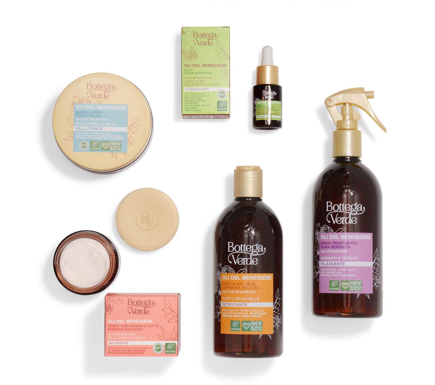
The characteristics of the Bottega Verde wellness oils line
To realise the packaging design of Bottega Verde’s wellness oils line, we at Studio Concept started by analysing the characteristics of these products. This is a body and face line that contains a formulation characterised by a combination of oils that give the skin energy. The sensation emanated is that of a pampering on the skin and rediscovered vitality, as well as relaxation and well-being.
The line that encompasses the power of five oils has given rise to a series of products that aim to enable a unique and effective daily beauty routine that fully respects the health and well-being of the skin.
At Studio Concept, we have differentiated the characteristics of the packaging design by creating it according to the different products that represent the line, namely: the shower gel, the body and face oil, the body skin butter and the face cream.
Each packaging enhances the characteristics of the products, which represent the ideal choice for those who want to dedicate moments of attention to their beauty.
The Bottega Verde values conveyed in the packaging of the wellness oils line
In choosing the packaging design of this Bottega Verde line, we considered the main values that the brand wants to convey through its products. The first concerns the natural ingredients, which characterise the brand’s formulations and which are carefully selected.
This aspect was highlighted in the packaging through the choice of colours and graphic references that lead back to nature. Furthermore, through the logos certifying the absence of harmful products, Bottega Verde’s firm position has been highlighted by excluding the use of chemical components from its products.