Home
Services
Beauty product packaging design
Graphic and Communication
Still life beauty and cosmetic product photography
Video Marketing and Photoshooting of Beauty Products
Social Media Marketing for the Cosmetics and Beauty industry
Websites and e-commerce for cosmetics
Professional service packages for start-up
Professional social media service packages
Work
Blog
Contacts
en
it
Conceptsnc
»
Work
»
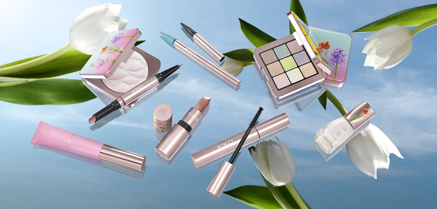
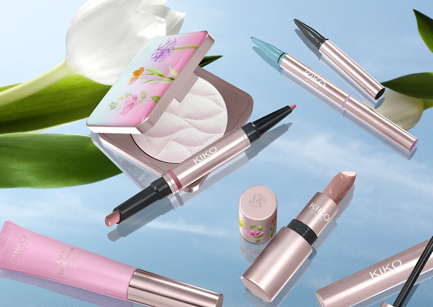
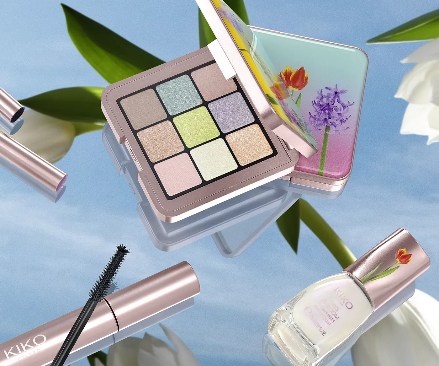
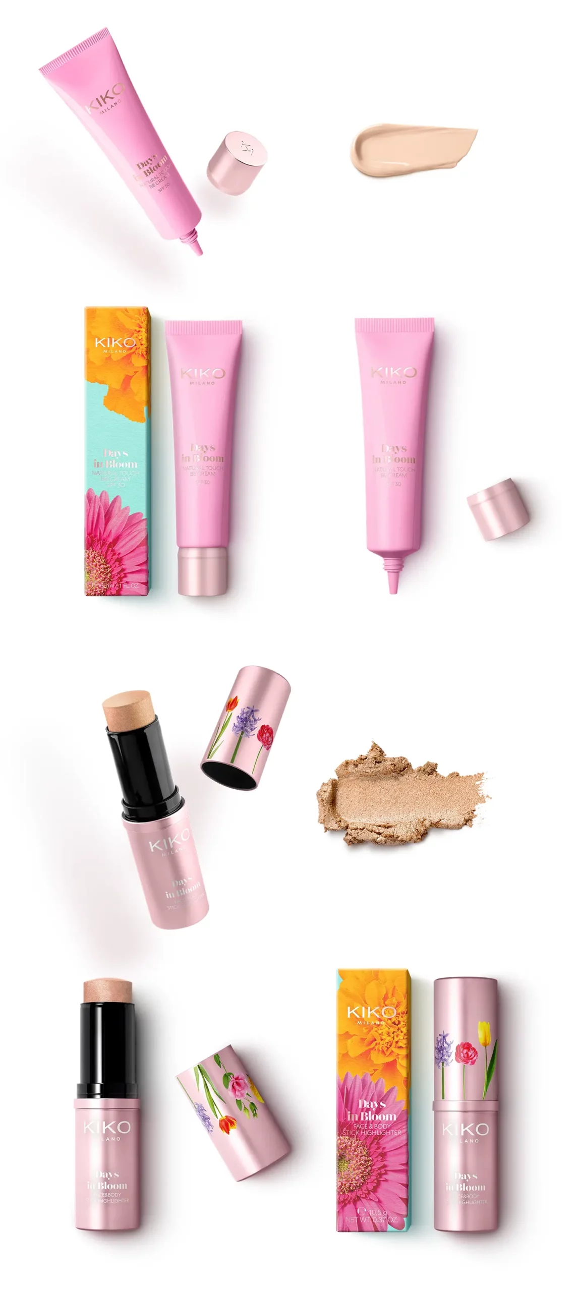
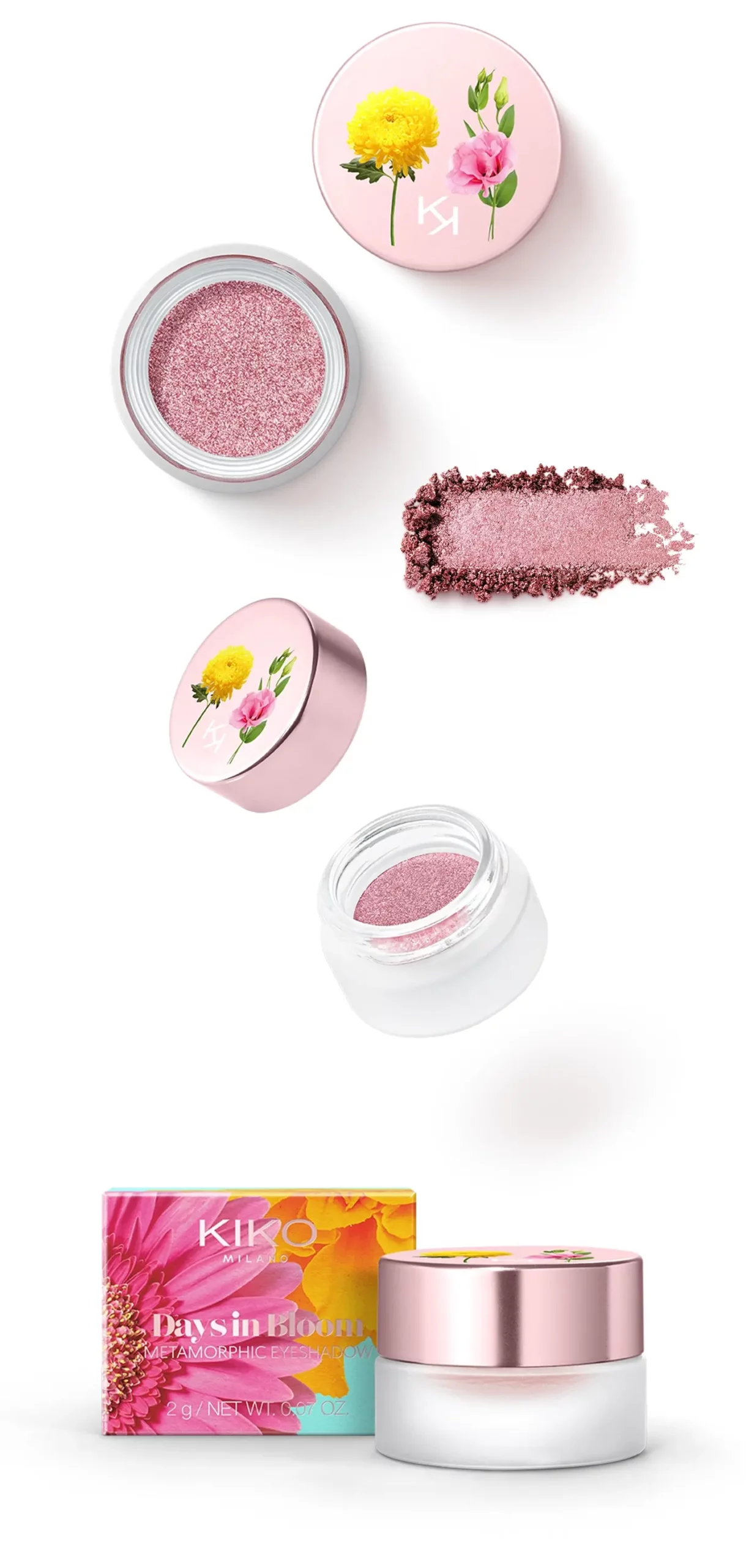
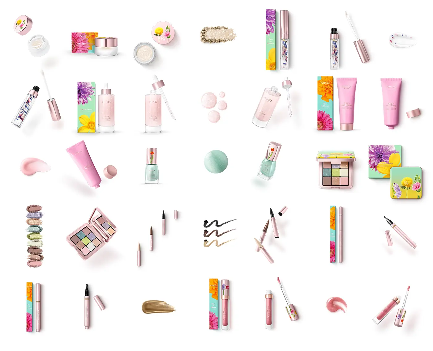
DAYS IN BLOOM
DAYS IN BLOOM
Still life
Related posts:
OLFACTORY SELECTION
CHOLLEY
Still Life e Catalogo per Villa Paradiso Home Cosmetics
BEAUTY ESSENTIALS
Home
Services
Beauty product packaging design
Graphic and Communication
Still life beauty and cosmetic product photography
Video Marketing and Photoshooting of Beauty Products
Social Media Marketing for the Cosmetics and Beauty industry
Websites and e-commerce for cosmetics
Professional service packages for start-up
Professional social media service packages
Work
Blog
Contacts
Start Typing
English
Italiano