Technique is not everything when it comes to still life in cosmetics. At Studio Concept we elevate product photography, we entrust it with a creative message, but we do it in a way that is consistent with reality. That is why the shot, when it is real, arrives.
Indice
Use the right lighting
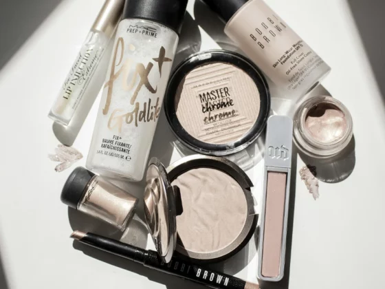
Never before has lighting made such a difference as in cosmetic photography. It is the products themselves that play with light; if the aim is to enhance but not to show, the “real” photo is all about lighting.
The classic window trick is one of the first tricks to be tried out, the 5,200K of illumination enjoys optimal diffusion when the source is natural. However, one is not always fortunate enough to be able to take advantage of this.
Here, multiple sources of illumination can be used to reduce shadows in the background. The use of a softbox, but also of a more classic diffuser, makes it possible to dose the ideal lighting for the cosmetic to be immortalised.
Experiment and choose a background that works
Should the still life entrust its communicative message to the cosmetic sample? This is true, but only in part. The backdrop of a shot is capable of conveying far more than one might expect, this is a little trick that not everyone considers.
The standard is matt white, which is the rule for online stores. Yet the background can make use of a particularly communicative colour range. For example, light blue is the tone that conveys clean freshness and is ideal for cleaners.
Warm tones are friends of summer products, sunscreen creams being one example. Pink is often associated with youthful products, while shiny textures are preferred for winter lines. The background also communicates.
Use cosmetic product ingredients as props
Still life works when it is driven by an underlying concept, after all it is creativity that makes the difference when photographic technique is followed to the letter. Talking about the ingredients is a choice that rewards.
Ideal for green cosmetics, the inclusion of ingredients is the useful step to summarise the essentials and make them usable at a glance. The only rule is the balance of colours, props can recall but must never contrast with the product.
The rule of thirds is always a valid principle, even when the scene is populated with ingredients. It is always better not to exaggerate, the shot must communicate an underlying harmony. After all, a good cosmetic promises just the right balance.
Contact us for more information on our services
Catalogue-style images
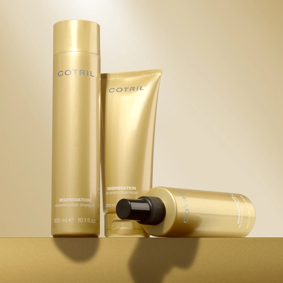
In theory, the still life professional should create a single set for all the products in the collection. This is precisely the case with the illustrative style, in which the products must adhere to a common stylistic figure.
Here it is the cosmetic that captures centre stage, the image must convey as much information as possible as the customer must be facilitated in his choice. However, one essential step is necessary for this to happen: the shot must catalyse the attention.
Where elsewhere the play of backgrounds and colours is sought, a catalogue works best when the background is neutral. White is almost a must here; it must be the product that speaks directly to the customer. Each article must adhere to the chosen style, which is why planning is the basis of a perfect catalogue.
Capture action shots
The challenge of commercial still life lies in conveying the cosmetic experience through visual communication, here photography is called upon to get closer to reality. Just as the customer enters the shop and experiences the texture of the product, so the action shots project the cosmetic into an active dimension.
The quality of communication lies precisely in the ability to reconstruct reality, the intuition for the right shot could therefore come through a brighter light combination or through the proof of use of the cosmetic.
Showing the texture of the product is just as important as illustrating how it is applied, so focusing on these aspects is a prerequisite for an action still life that reaches the target audience.
Back of product and ingredient label
Photographic details are instrumental in working to quality standards, the configuration of the camera and the use of appropriate media are just some of these. However, cosmetic still life cannot do without definition, the reason being in the details.
The back of the label is one of the details that the image must guarantee, the customer is indeed attentive to the composition of the cosmetic. Showing the ingredients is a choice that instils confidence, therefore, can weigh on the decision-making process.
A successful still life starts with the concept, elaborates it in a seductive way and develops a communication that reaches out.
Still life photography in the cosmetics industry is more than just a photographic technique; it is an art that requires creativity, sensitivity and careful planning. At Studio Concept, we understand that each shot is not just a visual representation of the product, but a narrative of its essence, spirit and the values it embodies.
Through the skilful use of lighting, the careful choice of backgrounds, and the ingenious incorporation of ingredients into our shots, we not only emphasise the aesthetic qualities of the product, but also succeed in communicating its identity and its impact on the consumer.


