Product packaging, Visual and Pop for Equilibria Shampoo

Packaging prodotto / Visual / Pop

Conceptsnc collaborated with Equilibria to develop the packaging and visual design for the Equilibria shampoo line.

Our work focused on creating visual communication that reflected the brand’s natural values and wellness philosophy. From the packaging design to the product positioning strategies, every detail was thought out to ensure an effective impact on the consumer, emphasising the purity of the ingredients, the effectiveness of the treatments and care for the environment.

We wanted to create an experience that would be engaging for the customer, focusing on a design that would convey authenticity and trust, key elements of Equilibria’s positioning.

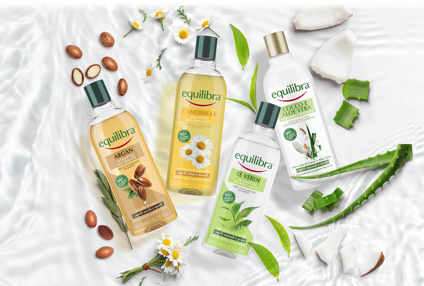
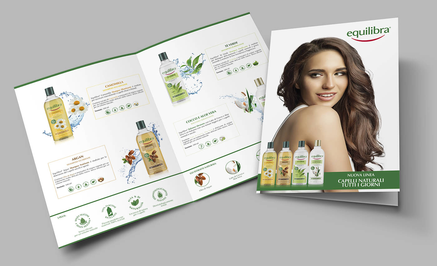
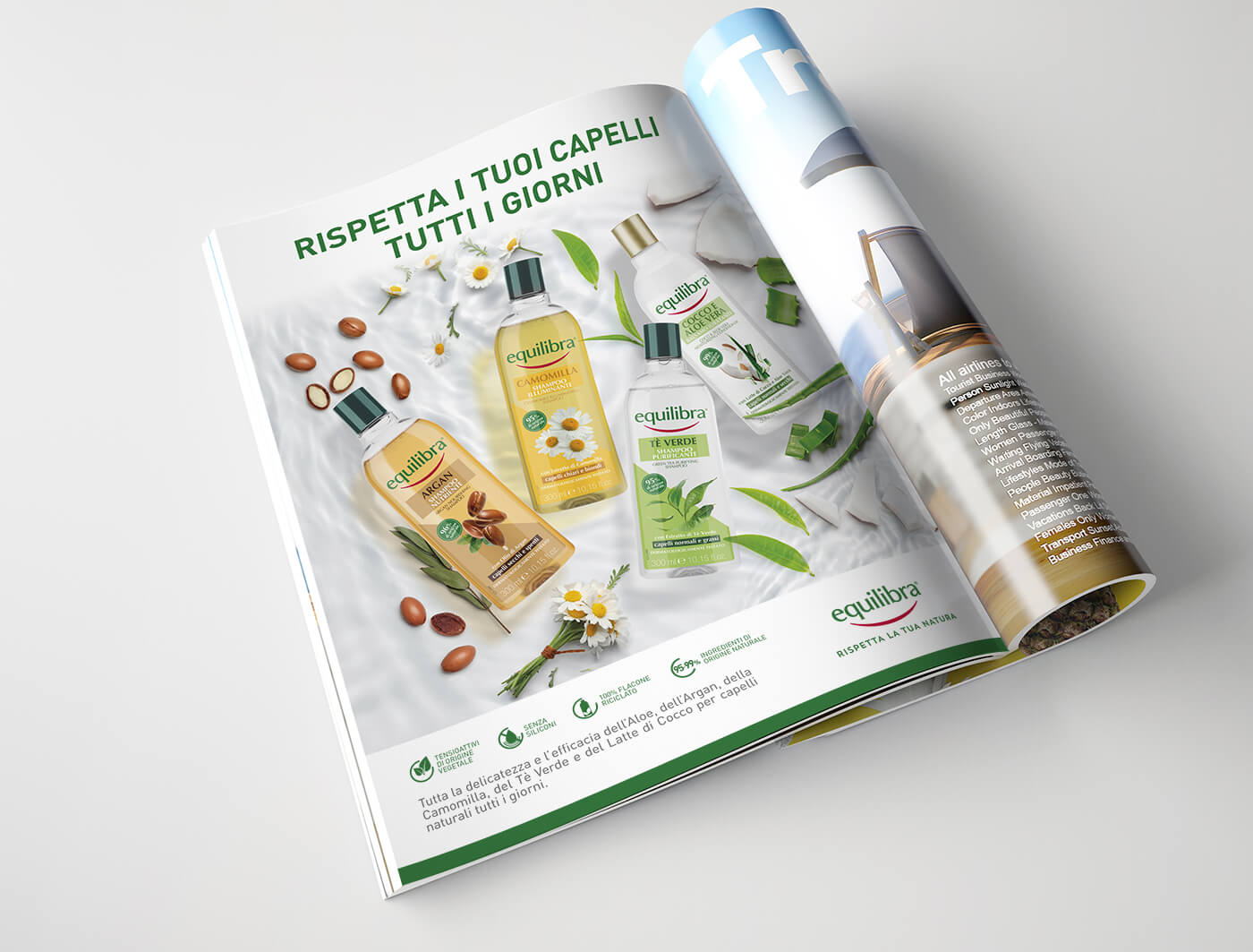
Con un’immagine coerente con il mondo cosmetico Equilibra è stata studiata una nuova linea specifica naturale di prodotti per capelli destinata alla Grande Distribuzione.
Lo Studio Concept ha studiato il concept grafico di linea e realizzato tutti gli esecutivi, gli elementi fotografici naturali presenti nelle grafiche e tutti gli strumenti di vendita: folder di linea, cartelli vetrina, espositori da terra e da banco.

Packaging and visual design

For Equilibria Shampoo, Conceptsnc designed packaging that would best express the naturalness of its ingredients and its focus on scalp well-being. The choice of colours was inspired by nature: green and earthy tones that evoke a sense of freshness and purity. The use of such a defined colour palette was essential to convey the message of a pure, effective and environmentally friendly product.

The design is essential but elegant, with graphic elements designed to create an immediate link between the product and the concept of balance and natural care. The use of sustainable materials also helped underline Equilibria’s commitment to environmental protection, a key element in the brand’s positioning. The focus on materials was crucial to meet the needs of a public increasingly sensitive to ecological issues and attentive to sustainable choices.

The visual design was developed with an integrated approach, creating a visual coherence between all communication materials. The images used in the promotional materials convey a feeling of well-being and vitality, emphasising the natural benefits of Equilibria shampoos. Each image was carefully chosen to reflect the idea of naturalness, purity and freshness that characterises the brand.

Positioning strategies

Conceptsnc’s work for Equilibria was not limited to packaging design, but also included strategies for positioning the product within the market. The objective was to clearly communicate the benefits of the shampoo line, targeting a health-conscious and environmentally aware audience.

This required an in-depth study of the target audience in order to develop messages that resonated with the values and needs of the typical Equilibria consumer. The visual campaign and POP (Point of Purchase) materials were designed to attract attention at the point of sale, highlighting the natural ingredients and effectiveness of the hair treatments.

Thanks to a studied visual positioning and attractive packaging, Equilibria Shampoo stands out on the shelves, succeeding in conveying a clear message of care and respect for nature.
The coherence between packaging, visual design and POP materials has created a unified experience that engages the consumer from the first glance, generating trust in the brand and increasing the perception of product quality. This integrated approach has positioned Equilibria Shampoo as an ideal choice for those seeking effective, sustainable products in line with a healthy lifestyle.

The collaboration with Equilibria highlighted our ability to create visual communication solutions that are both aesthetically pleasing and strategically effective.

Each element of the project was designed to contribute to a coherent and engaging narrative, capable of attracting and retaining consumers, reinforcing the brand’s positioning as a leader in hair care with natural ingredients.