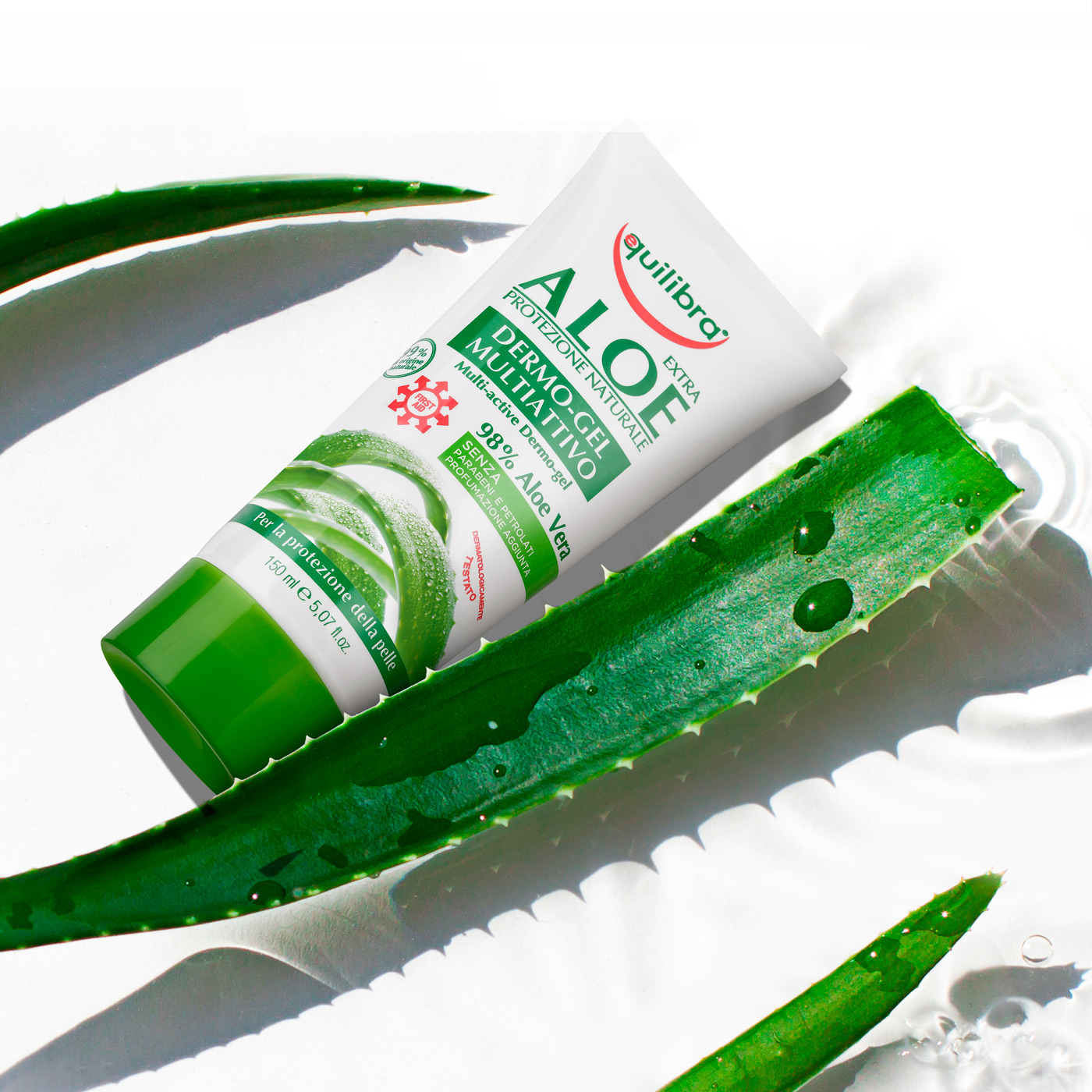
Still life product photography for Equilibra moisturising cream
The photograph still life of the Equilibra moisturizer has been cleverly designed to highlight the main feature of the product, that is its natural origin.
Aloe Vera leaves are in fact the drug from which the cosmetic product’s main active ingredient is obtained, that is, aloe gel.
The special shade of green immersed on a light background is highlighted by the carefully studied contrast, precisely to arouse a sensation of freshness in the user, which is the main strength of the moisturising cream.
The sunlight further evokes the idea of healthy and natural moisturising, also considering the fact that the Equilibra moisturising cream is recommended precisely as an after-tanning moisturiser.
The oblique shadows are used to give volume to the immortalised products in such a way as to create the notion of wealth, in terms of the formula.
A still life photo of a product can seem like an apparently simple choice, given that it “only” needs to depict the product and summarise its characteristics.
In reality, it is an extremely delicate process that requires specific knowledge regarding the language of images, in order to transmit unambiguous, non-verbal messages.
Packaging for Equilibra moisturising cream
The special packaging for the Equilibra moisturising cream is based on the simplicity of the background, the aim of which is to summarise the commercial objectives of the product.
The Equilibra moisturising cream is in fact aimed at an extremely diverse public, who is looking for none other than a cream with basic characteristics, without any miraculous effects.
The water droplets, expertly placed on the leaf, have been precisely positioned to reflect the light that ideally strikes the plant the moment it is immortalised in the photo.
Aloe Vera gel, the main ingredient of the cosmetic product, is distinguished by its moist and soft texture, responsible for the moisturising and toning effect on the skin.
This action is emphasised by accentuating the succulence of the Aloe Vera leaves, a plant effectively able to store large volumes of water compared to other plants, the leaf size being equal.
The special shade of green, which diagonally cuts across the white background, is specifically designed to impress the observer and be etched in their memory, while at the same time guiding them towards a dynamic, rather than static idea.
In fact, the many benefits proclaimed by the Equilibra moisturising cream also include a light, comfortable sensation thanks to a non-greasy formula, which would otherwise prevent the skin from transpiring.
A product’s success is inextricably linked to its carefully designed packaging, given that it represents the first (and sometimes only) discriminant for the consumer when making their purchase.
Focusing the attention on the contrast between the green and white, and highlighting it with a red curve under the brand’s logo, means building a sense of trust in the user towards the cream; hence the inverted arch below the Equilibra wording becomes an absolutely essential detail in this very unique packaging.
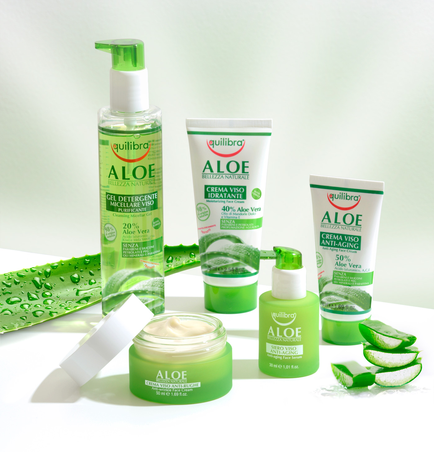
Online advertising for Equilibra moisturising cream
With regard to the online advertising for the Equilibra moisturising cream, the attention was decidedly focused on the succulence of Aloe Vera, insofar as one of the most important properties of this plant.
The clean diagonal cut of the plant leaves gives the ad a particularly suggestive focus on hydration, given that the water retained by the gel is promptly transferred to the skin treated with the product.
The translucent drops appear once again, illuminated by the hypothetical summer sun, possibly to evoke warm temperatures and the humidity rate typical of the summer season, when it is particularly recommended to use the product.
The Equilibra online advertisement summarises the entire line of Aloe Vera cosmetics, celebrating their versatility through the presentation of products in a diverse range of shapes and sizes, yet perfectly harmonised by their reciprocal arrangement in the space.
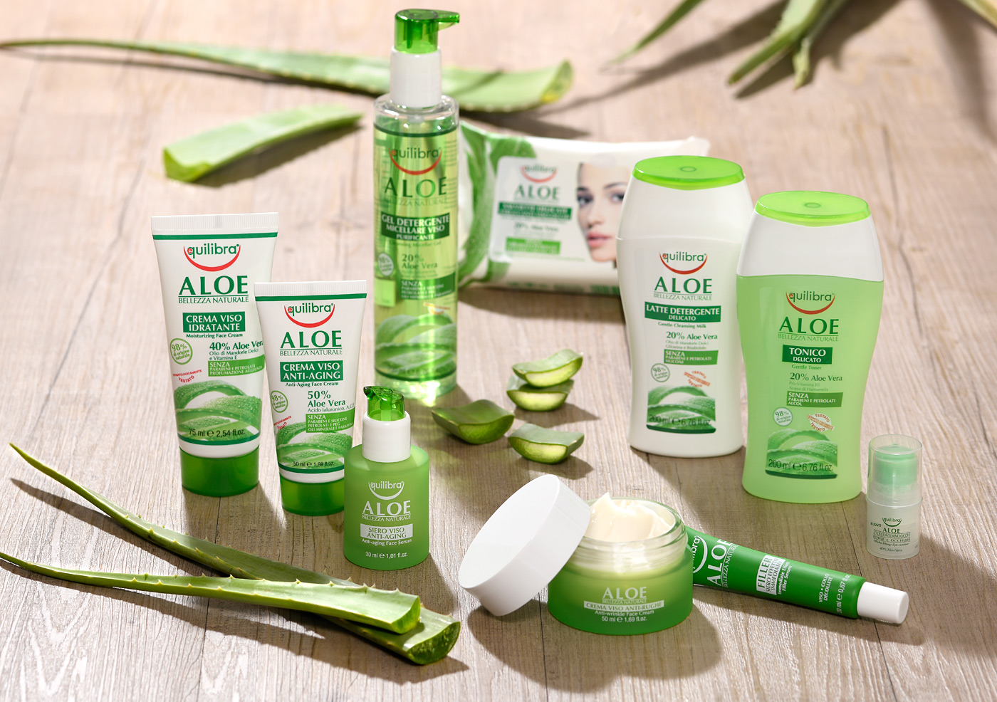
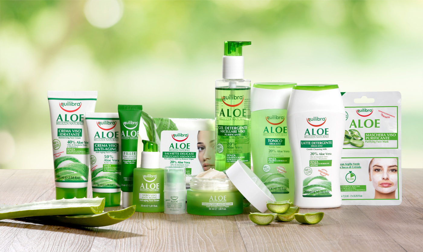
Special Equilibra Aloe Viso line
?A complete line of cosmetics for facial treatment and care, based on Aloe Vera.
Packaging design
Rendering of the product
Still life
Point of sale communication
Exhibitor design
Sales tools
Video
Social content