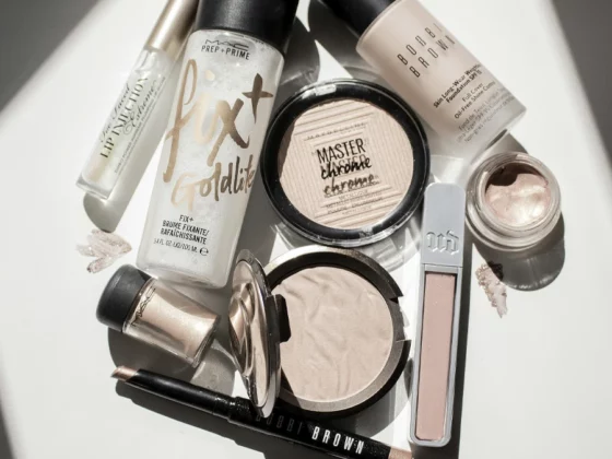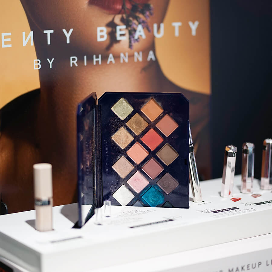
When we buy a cosmetic, the first element we observe is the logo: this symbol can immediately identify the product and convey the quality of the brand.
For the most famous and historic logos, this link is direct and immediate because the consumer knows the brand, and already has in mind the positioning of the brand in terms of quality and price. On the other hand, it is more difficult for the logos of new or very niche brands. However, the logo graphics should always attract attention and, in some way, identify the positioning of the brand. But let’s see some examples.
Indice
Evolution of logos, history, and growth
The logo is a basic element in the brand identity, so the colors and fonts used must be consistent with corporate values. If you need to create a logo for your cosmetic brand, first of all, it starts with the clear construction of the Brand Identity of your brand which, as we will see, is not just a matter of fonts or colors, but it is much more because it is the distinctive trait of your brand in terms of style and communication and the logo or logotype is only one element.
The first logos date back to ancient Greece, a period in which the sovereigns had monograms engraved on their coins; later, during the Renaissance, craftsmen used original emblems on their works to differentiate themselves from the competition.
At the end of the 1800s, logos had different graphics from what we are used to elaborating designs, and fonts with serifs were preferred.
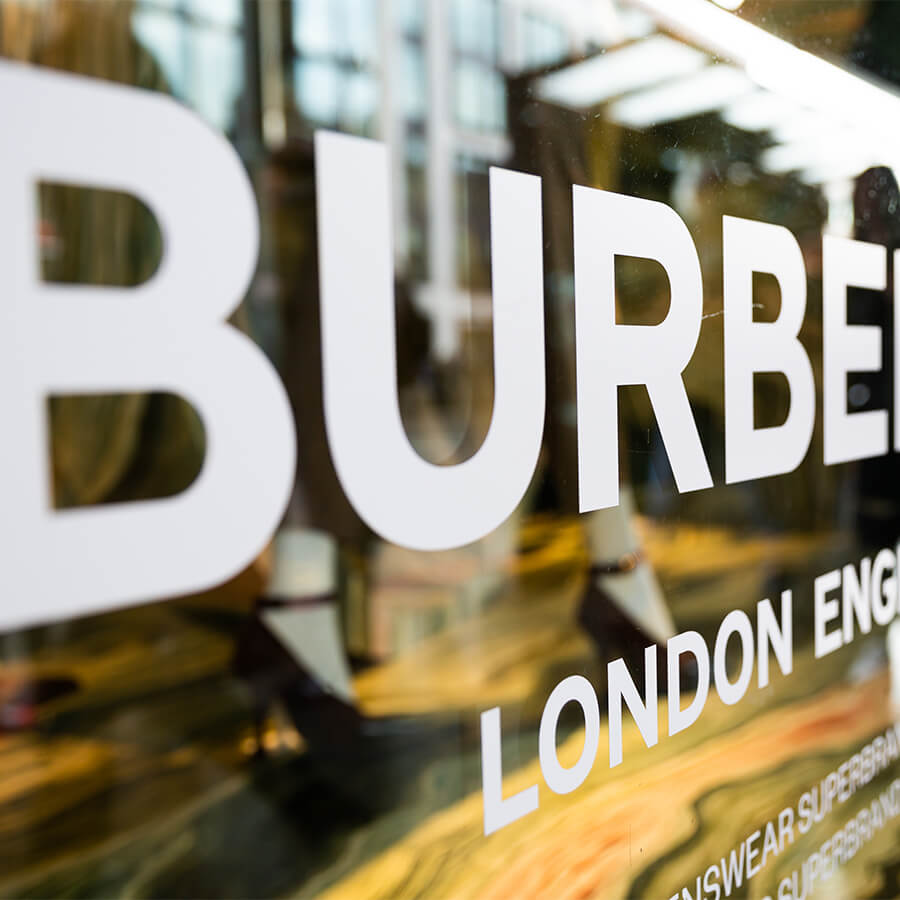
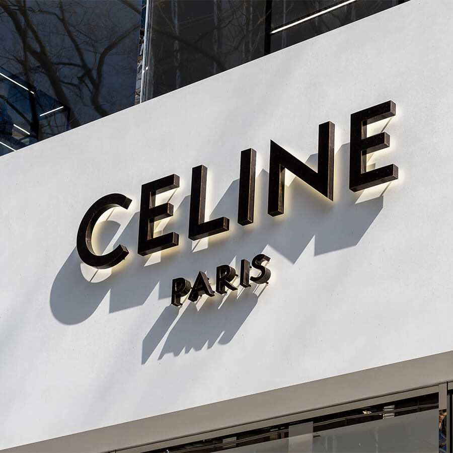
Nowadays, on the other hand, there is a tendency to simplify one’s brand as much as possible to have an immediate visual impact on the consumer. It is a trend that is also strongly present in the world of cosmetics. This trend is present in prestigious international fashion brands, even in the luxury segment. Think, for example, of the new Burberry logo, or that of Celine or Saint Laurent, all distinguished by clean and almost elementary stick fonts.
Brand and cosmetic logos: how to create them?
Creating a cosmetic brand means building an emotional and visual world, specifically identifying the mood, defining the target, asking the reason for being of this new brand around a credible story to tell, and making use of a captivating, unique, and as original as possible visual style.
Therefore, to design a brand and cosmetic logos, you will need to rely on a communication agency that can create or rework your logo and packaging graphics, always starting from an in-depth study of all the elements that identify its brand identity. Come and discover, for example, the page dedicated to our global agency services for start-ups in the cosmetic sector.
We at Studio Concept support companies every single day with specialized consultancy on brand identity, marketing positioning, logo creation, packaging, photos and videos, social editorial plan, and website creation. A demanding job, from an economic and time point of view.
The main activities that allow for the conception and construction of a successful cosmetic brand must include:
- The Target Study of the Competitors
- The clear definition of Reason Why
- Identification of the main distribution channel(s).
- The creation of an original visual-conceptual-communicative Brand Identity
- The creation of an identifying narrative Storytelling
- Logo creation
- The definition of the Graphic Style of the collection or line products
- The production of Photo and Video Content
- The construction and management of Social Channels through a real strategy
- For online projects, the construction and management of the e-commerce website consistent with the defined Brand Identity
- The launch strategy, is mainly linked to the investments available in terms of advertising
Don’t know where to start? If you want to develop your new cosmetic line or if you want to reposition and review your offer of beauty products already on sale, we at Studio Concept are the right agency for you.
We use different approaches for each client: whether you are a start-up or a large company with the need to reposition yourself on the market, we have the solution that best suits your needs.
Contact us if you have any restyling projects for your line, if you want to launch a new skincare collection, or if you need to build your new cosmetic brand from scratch.
Cosmetic logos for Beauty products
Many graphic studios deal with creating logos for various business sectors without having in-depth knowledge of the rules of a specific market segment. What is the result? The final message that reaches the consumer can be compromised.
In particular, the beauty and cosmetics sectors need targeted marketing strategies to attract the attention of the reference target.
Do you need to create a logo and communicate your brand identity?
We at Studio Concept decided, now more than 20 years ago, to specialize in the beauty and cosmetics sectors, to help companies like yours create the best action plan through our verticalized services.
Logos of the most famous cosmetic companies
The number of cosmetics manufacturers continues to increase exponentially, and the increase of new brands that are proposed on the market in this sector is constant. Globally, the cosmetics industry is projected to reach $758.4 billion by 2025.
But what is the secret of these companies? Let’s find out together!
1. Aveda
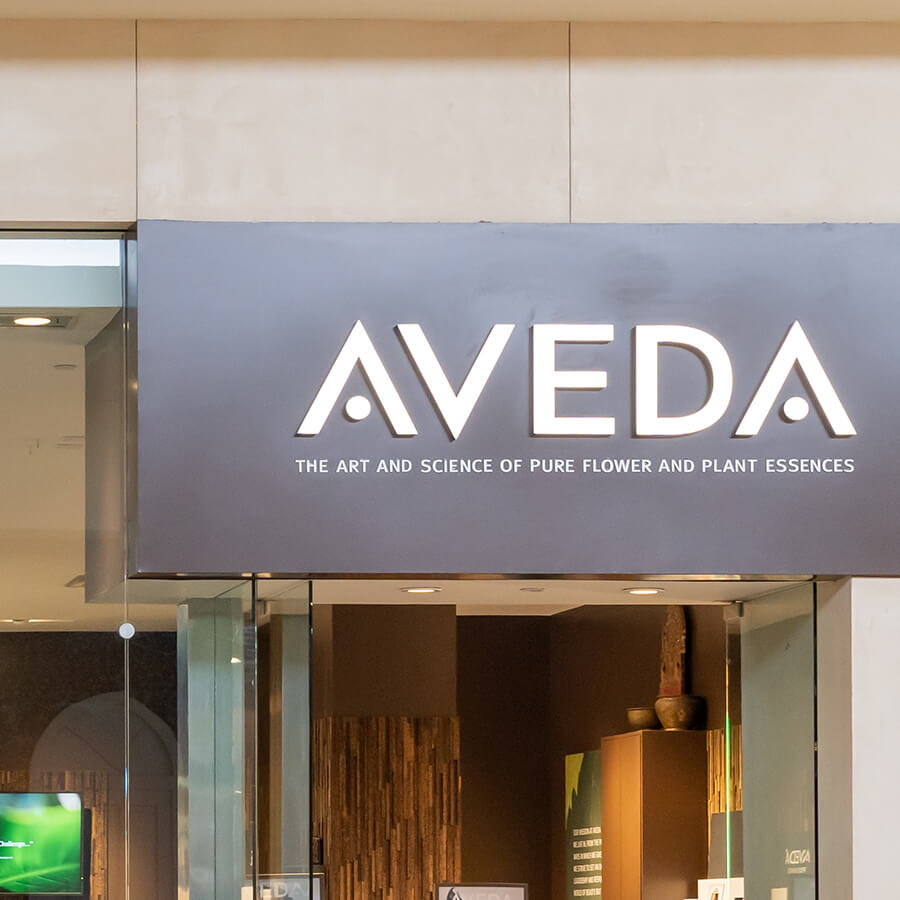
Founded in 1978, Aveda is a cosmetics company that has decided to keep its logo unchanged over the years.
Color is the only element that the brand varies in the branding, although it usually uses the black logo on white background, to convey refinement and elegance.
In all versions of its symbol, Aveda uses capital letters, with a geometric shape and a sophisticated design.
The company has chosen to replace the line of the letter “A” with a circle and to use sans-serif, strategic decisions capable of communicating balance, one of the company’s core values. The attention paid to the choice of product ingredients is highlighted starting from the name of the brand, which in Sanskrit means “knowledge”.
2. Avon
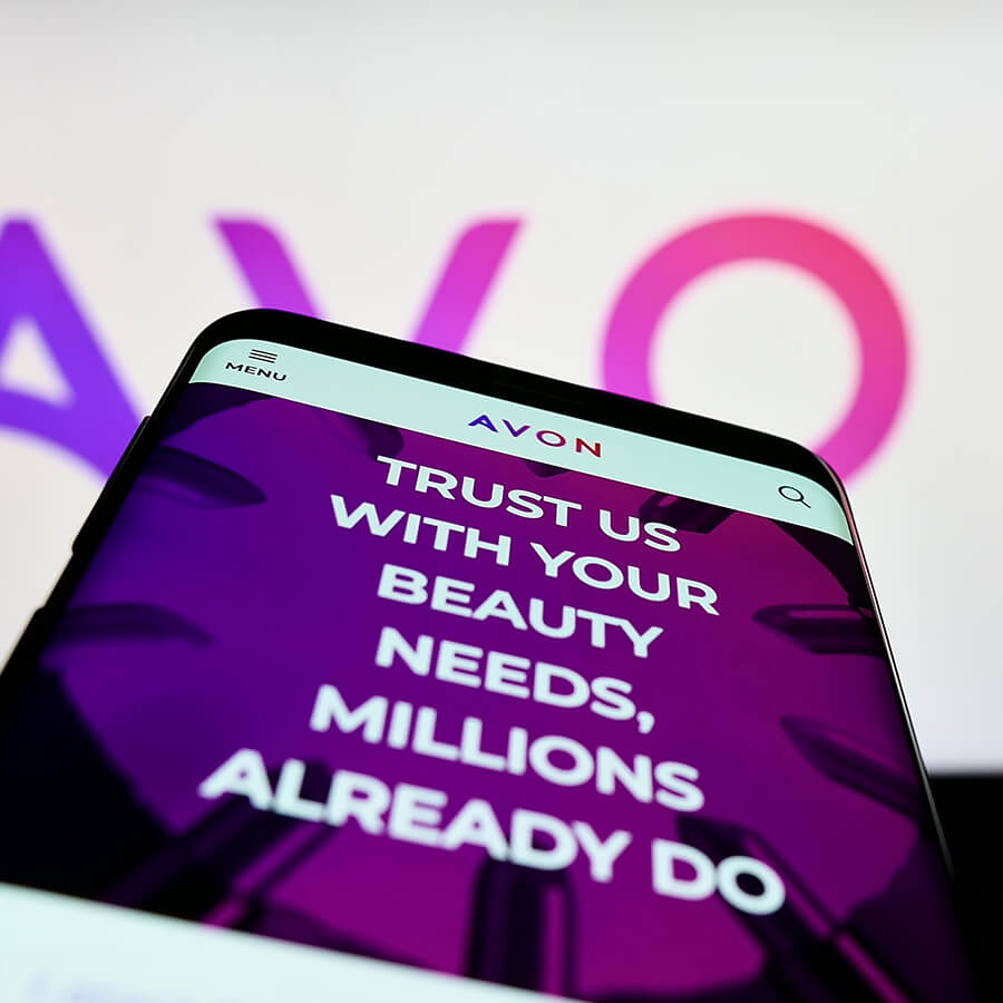
Avon is a company founded in 1886 in Great Britain under the name of California Perfume Company, and over the years, it has established itself worldwide for its cosmetic products.
McConnell, the creator of this brand, chose the brand name inspired by his favorite author, Shakespeare, who was born in Stratford-on-Avon.
The brand symbol has undergone numerous changes up to the final version, full of bright and alluring colors.
The first version of the logo, dating back to 1886, features the inscription “California Perfume Company” with ribbons and a floral circle.
In 1904, the company decided to simplify the style of the logo: the bows remain, while the flowers and gradients disappear; in 1911, the founder of the brand chose to use the acronym “CPC” in serif fonts.
The company only used the word “Avon” in 1930, creating a brand that was innovative for the time, thanks to the sans-serif and the smooth and curving design of the letter “A”.
In 1936, the company recreated the brand identity, using an “A” and an “O” of “Avon”, which, together with the tulip inserted in the logo, recalls the sinuosity of female forms.
In 1947, the brand’s appearance changed again: the floral symbols were changed and the serif was chosen; in 1954, just like other companies in the sector, the brand uses the signature style for its branding.
Twenty years later, the cosmetics manufacturer adopts a basic wordmark with all capital letters, except the “n”, to create visual harmony.
In 1997, Avon opts for a logo in blue that, due to its clean and linear look, fits the historical period, and, ten years later, the company chooses a minimal sans-serif font in pink.
Finally, in 2020 the brand team develops a brand with pink and purple shades, capable of conveying a feeling of reliability and creativity to consumers.
Contact us if you have any restyling projects for your line, if you want to launch a new skincare collection, or if you need to build your new cosmetic brand from scratch.
3. Benefit

A company like Benefit can communicate a feeling of simplicity and security to customers starting from the logo.
Acquired by LVMH, this brand has kept the wordmark unchanged to this day, positioning itself among the major manufacturers of luxury cosmetics.
The logo of this brand is exceptionally elegant, thanks to the lowercase serif with the stylized “f”, a detail that could be a tribute to the Ford twins, founders of the company.
Furthermore, the capitalized writing “San Francisco” placed under the name by Benefit provides the feeling that the products are made in a neighborhood familiar to the customer, recalling the origins of the brand.
The packaging of the products is in a pin-up style with bright colors, as is the writing of the logo, which has often changed nuances.
4. Chanel
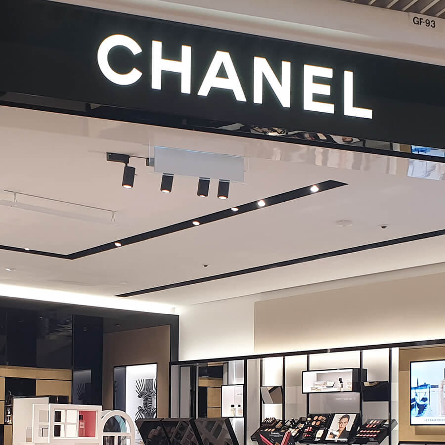
Since 1909, Chanel has been one of the most iconic brands worldwide for its high-class cosmetics and accessories, which convey the values ??associated with luxury and refinement.
The company logo uses the word “Chanel” in an uppercase sans-serif font and has never distorted its appearance, remaining consistent with the company’s core values.
The most captivating element of the brand is the monogram represented by two “Cs” intertwined, which is often the only symbol engraved on the brand’s products.
Sometimes, the letters are surrounded by a circle, other times Chanel has preferred to omit it, but, in any case, these are marketing strategies for the product lines corporate.
It is assumed that the logo was created inspired by the handwriting of the creator of the brand, an extremely elegant sans serif character, an aspect accentuated by the wide spacing between the letters; moreover, the colors chosen are black and white, with variations in gold and silver.
5. Clinique
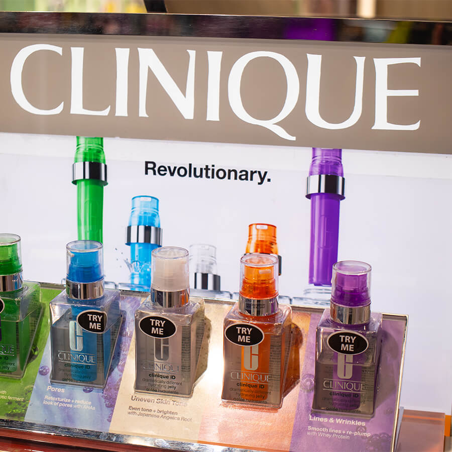
Founded in 1968, Clinique is a cosmetic company renowned worldwide for its quality products with refined designs.
These elements are highlighted starting from the company logo, which features a serif font with an original touch in the glyphs and with a line at the top and bottom of the wordmark.
The visual effect of the logo is immediate: the consumer sees Clinique as a trustworthy brand which creates products with compositions attentive to personal care.
The logo aesthetic has never changed, and the only element that changes between one collection and another is the color of the emblem, which can be made in black or white.
For some product lines, Clinique has chosen to put only the letter “C” on the packaging, which still manages to provide a strong visual impact on the consumer.
Logo and Brand Identity
If you find yourself in the situation of wanting to review or update the logo of your cosmetic line or brand, perhaps you should also review the communication style of your brand starting with real analysis, also thanks to an external comparison that allows you to see your brands from different points of view. Sometimes it’s enough to resume and make the most of the more coherent choices you’ve made in the past, perhaps with a touch of modernity. Many other times, however, a real relaunch is necessary which involves the definition of a new Storytelling, thus also involving the style of communication, packaging, social channels, or the e-commerce website. The logo is therefore only one element, an important one, but still an element within a much broader creative and marketing process.
Studio Concept is by your side.