Packaging graphics, Rendering and Video for Equilibra-linea rosa
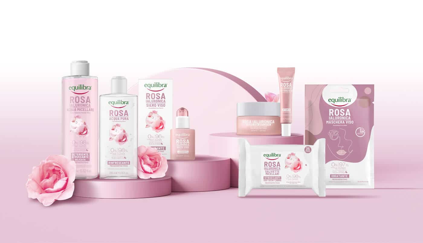
The Rosa Ialuronica face line from the Equilibra brand is the ideal collection for taking care of your skin and introducing a proper skincare routine into your daily routine. It comprises 8 products, including a moisturising face cream and an anti-ageing cream for more mature skin. In addition, there is a smoothing serum, a toner that rebalances the skin’s pH, micellar water that cleanses and removes make-up residue and, finally, rose-free wipes, an eye contour and a moisturising face mask.
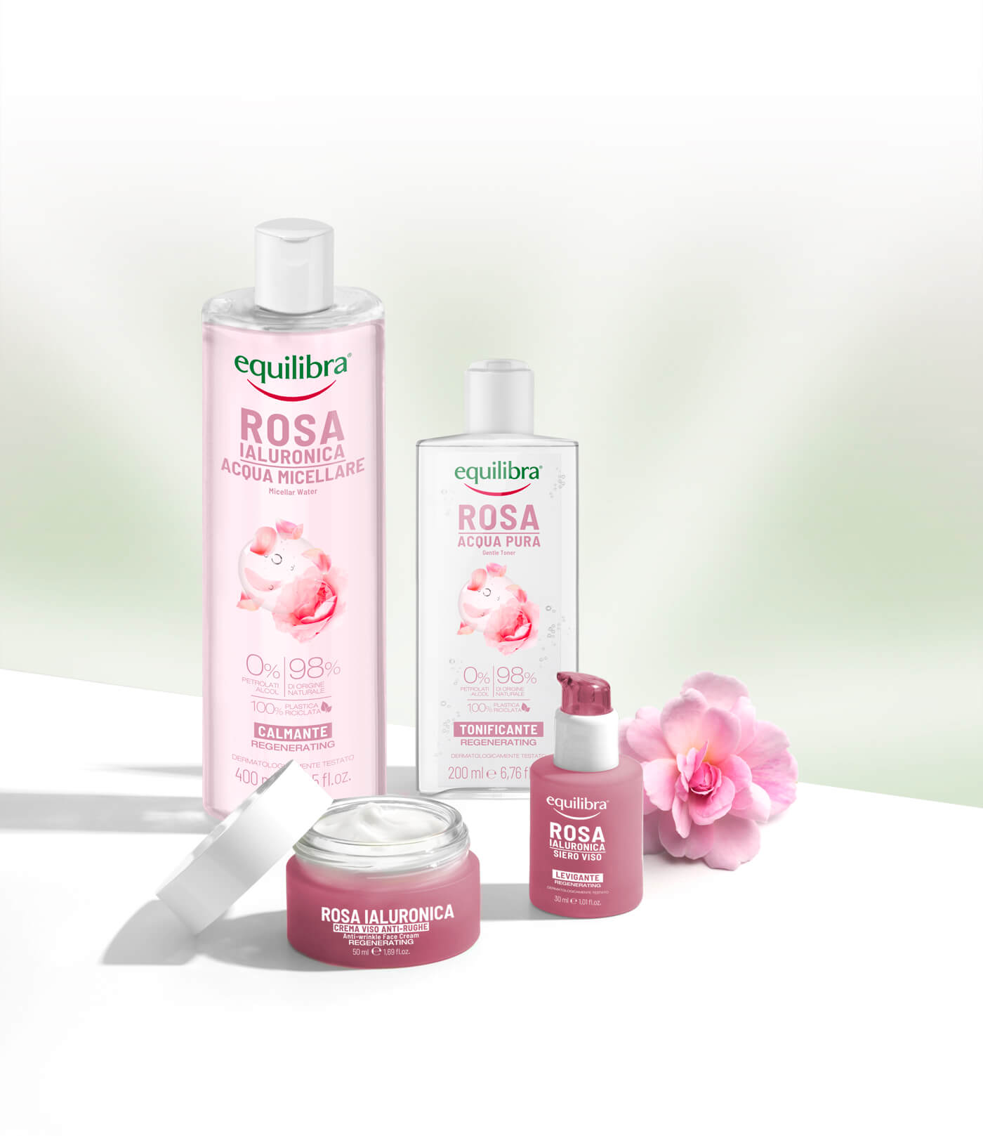
The common ingredients among these products are fermented rose, with an important antioxidant action, and hyaluronic acid, which provides hydration and protection for the skin, increasing its elasticity.
Equilibra is a brand that offers skincare and cosmetics products of quality and, above all, composed of ingredients from which many benefits can be derived. It pays particular attention to the needs of consumers, creating lines of moisturising creams, cleansers and serums for all skin types.
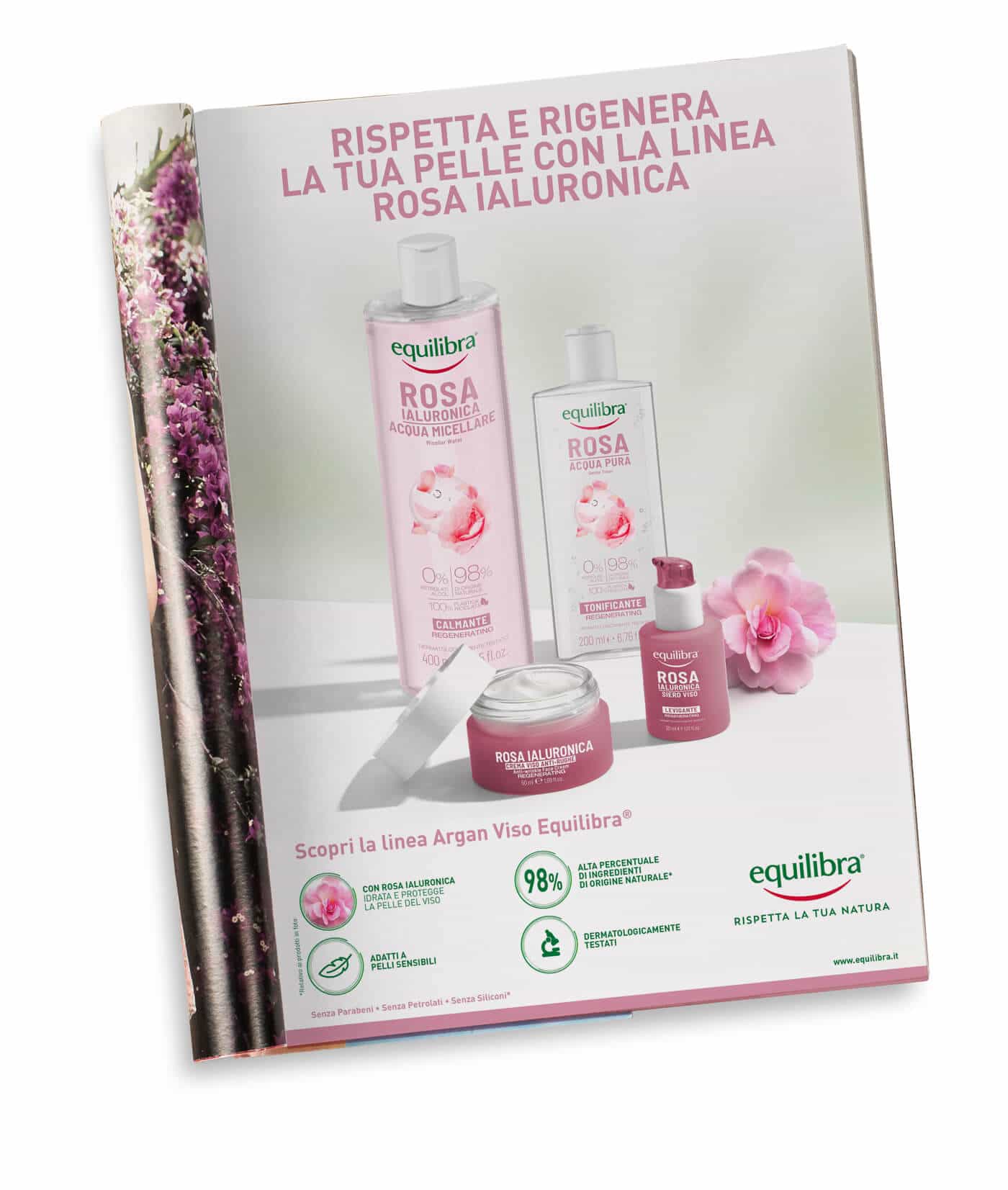
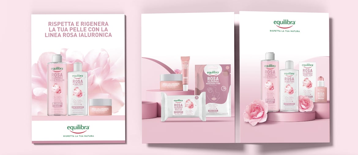
For the packaging of the products of Equilibra’s Rosa Ialuronica line, a minimalist and clean graphic design was chosen, with packaging in neutral colours, where white predominates, representing the freshness and genuineness of the ingredients. The pink details recall the petals of the fermented rose, a key ingredient within these cosmetics. In addition, the composition materials of the packaging of this line are robust and well-designed, to keep the products intact inside and ensure maximum efficiency for as long as possible. This is very important, especially since otherwise the skincare products could risk coming into contact with moisture or sunlight and oxidising.
Attention to packaging is also about aesthetics; understanding the message a brand wants to communicate is crucial to reach the audience effectively. Packaging is often underestimated, but it is actually one of the main elements you need to think about in order to reach your niche.
In this regard, Studio Conceptsnc also used video making techniques to achieve the objectives agreed with the client. The power of a video is greater than that of a simple photo shoot; a greater visual impact is achieved and the client has a more concrete perception of the results of the product he would like to purchase. With the right advertising choices and well thought out framing, an excellent degree of visibility for the brand can be achieved.
For the photos proposed for the Equilibra-pink line, the photorealistic rendering technique was used; rendering is used to enhance the quality of the visual appearance of a photo. A three-dimensional product is shot which, once processed through digital tools specifically designed for rendering in post-production, gives life to a realistic image.
All this is the result of an analysis of the market, of consumers, but also of years of studying communication techniques in the beauty and skincare sector. Customers do need quality, high-performance products, but if you don’t reach their curiosity in the pre-sales phase, you won’t get the same results.