Ninety seconds elapse between exposure to the stimulus and the decision. The funnel game lasts that long, every detail is crucial to convince. Competition runs fast, cosmetics and make-up are the sectors that rely most on incisive communication. It’s all about images and colours, we at Studio Concept have been working on this for over 20 years.
Find out more about our cosmetic marketing service.
Indice
What elements determine the choice of colours in packaging?
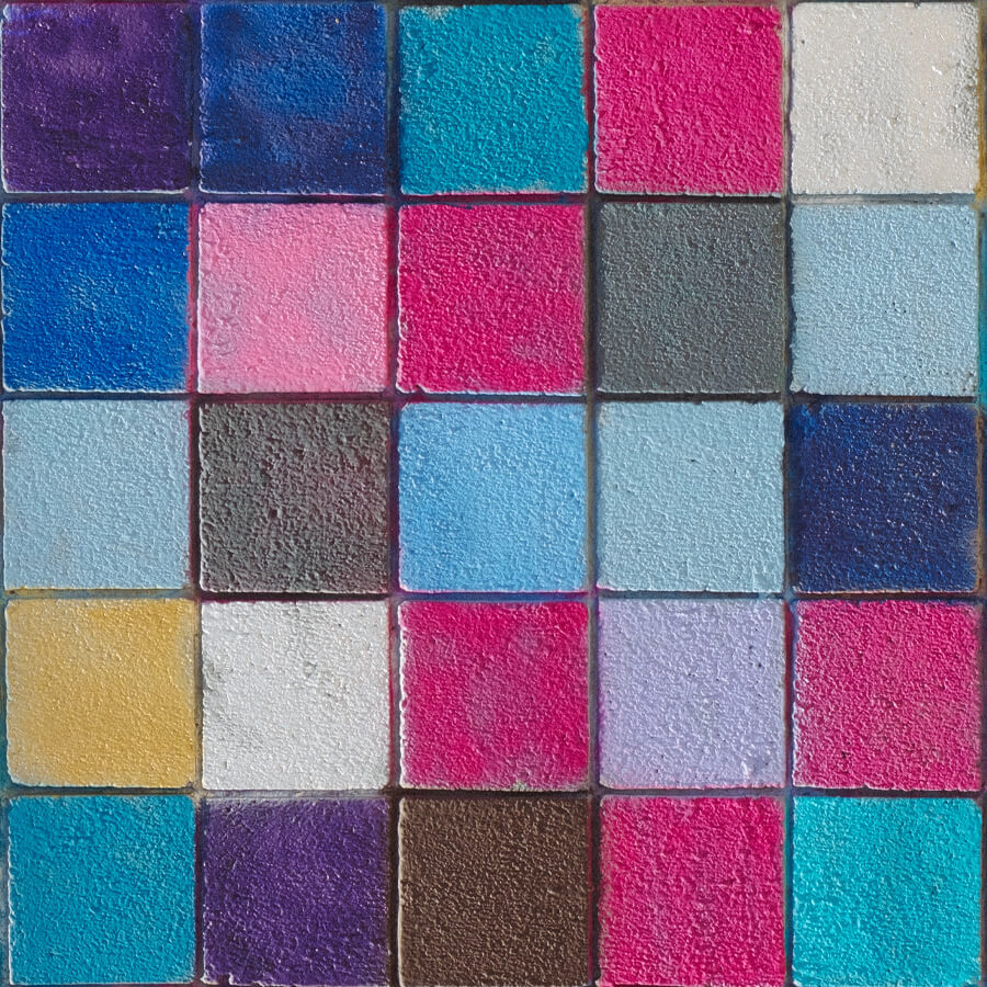
A quick look at the statistics may make the underlying theories more concrete. It is no coincidence that more than 30% of brands rely on the colour blue, around 30% opt for red, 28% prefer grey or black and only 10% prefer yellow. Colours have a disruptive force in communication, they can describe the product but above all represent the brand and convey its message to the customer in a more pronounced manner.
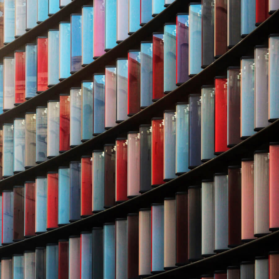
Colour is one of the most powerful tools in the service of packaging design, it accompanies the product with a message that disposes the customer towards the type of article. One example among all, “Coca-cola red” is the one that best represents the packaging of the international brand. Varying the colour would be a real media hit, the passion of red is enriched by its long history. Each colour is therefore capable of conveying an ancestral message, tracing its psychology is one way of interpreting the correct colouring in packaging.
Brand identity and the message to be communicated
Brand awareness is the target at which all businesses in the commercial world aim, the principle applies even more so in the make-up and cosmetics sectors. If colours are actors of an innate representation, there is however the risk of homogenising the difference between competitors, this is where the role of image and communication professionals comes into play: there are those who resort to matching variants and those who, on the other hand, adopt countertrend solutions. The aim is to communicate but to do so by standing out, not everyone succeeds.
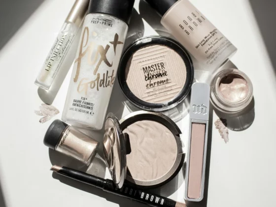
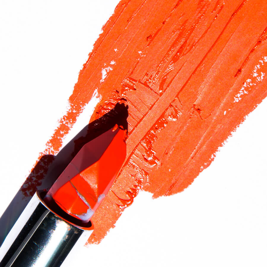
Based on objective findings, it is enough to bring to mind the typical set of lipsticks. If we think back to the dominant colour, red would certainly take centre stage. Here, however, a game is being played where hundreds of brands are competing in the beauty industry, the classic identity with colour would be in danger of faltering. If you close your eyes and brush up on the images in your mind, you would realise that each brand uses a particularly distinctive shade of red. Here, simply multiply the effect by the 2.3 million colours available and search for your own distinctive tone: the power of colours is all here.
Contact us and we will be happy to put our twenty years of experience at your service.
Meaning and Psychology of Colour in Cosmetics Packaging
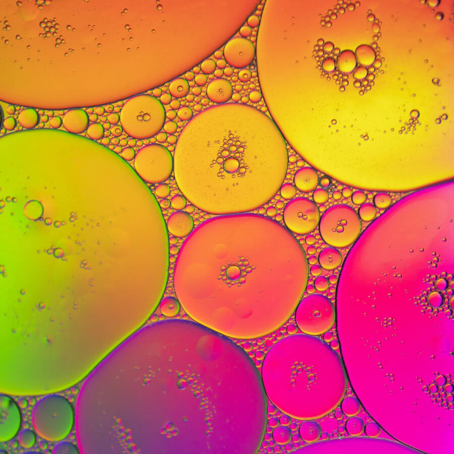
Neuroscience has become interested in the psychology of colours rather recently, each tone being able to stimulate and predispose the individual who decodes its message. It is a deep-rooted but not direct communication, which makes use of the messages of the non-verbal code. Red is the colour of fire, white is the colour of white snow, yellow is the energy of the sun and blue is the intensity of the sea: these are messages that are born with the individual, precisely because they are imprinted in his or her genetic experience. Hence the search for the combination that communicates, entrusting it precisely with the message of colours.
Warm colours: yellow, orange and red
Yellow is the colour of optimism, marketing makes strategic use of it when it intends to express the concepts of creativity and project construction. It is a colour that speaks of the future, and it is no coincidence that it is used by brands such as Ikea whose aim is to provide the necessary to build homes creatively. Red is the other primary colour that stimulates dynamism and, of course, passion. It is also the colour that evokes appetite but above all urgency, it is in fact the one used to signal the last available pieces of a product. Orange is the derivative colour, yellow and red combine to communicate balance of energy, creative confidence and inner peace.
Cool colours: blue, green, violet
Blue is that of the sea; its effect on the human psyche is to relax. It is no coincidence that shades of blue are used to communicate a sense of tranquillity. Meditation but also security are associated with blue, so is it any coincidence that the banking and medical sectors, but also some social networks, are associated with the colour blue? Green is reassuring, it belongs to deep-rooted tenacity like nature: its message is positive just like blue. It is a colour that speaks of nature and health, it belongs to the organic sector but also to more concrete financial solutions. Purple is serenity but also luxurious elegance, it belongs very much to beauty declined by women.
Contact us and we will be happy to put our twenty years of experience at your service.
Neutral colours: white, black, grey, brown
Black and white are the antipodes that court each other; purity often inspires contrasts. Black, on the other hand, is refined elegance; Gucci’s, for example. Brown satisfies the body, it recalls chocolate and good coffee. Grey is the neutral, melancholic but often used in marketing campaigns.
Do you want to renew the packaging of your make-up line and are you looking for a specialised design service for the beauty and cosmetics world?
Are you launching a new skin care line and need to realise the grand identity and visual identity of your new brand?
Do you need to create your own cosmetics ecommerce for your line and want a highly professional and innovative project that best communicates your values?
Do you know that your product images and videos are key to communicating your brand in a modern way on social media and are you looking for a partner for photo shoots and advanced post-production to create an editorial plan consistent with the style of your products?